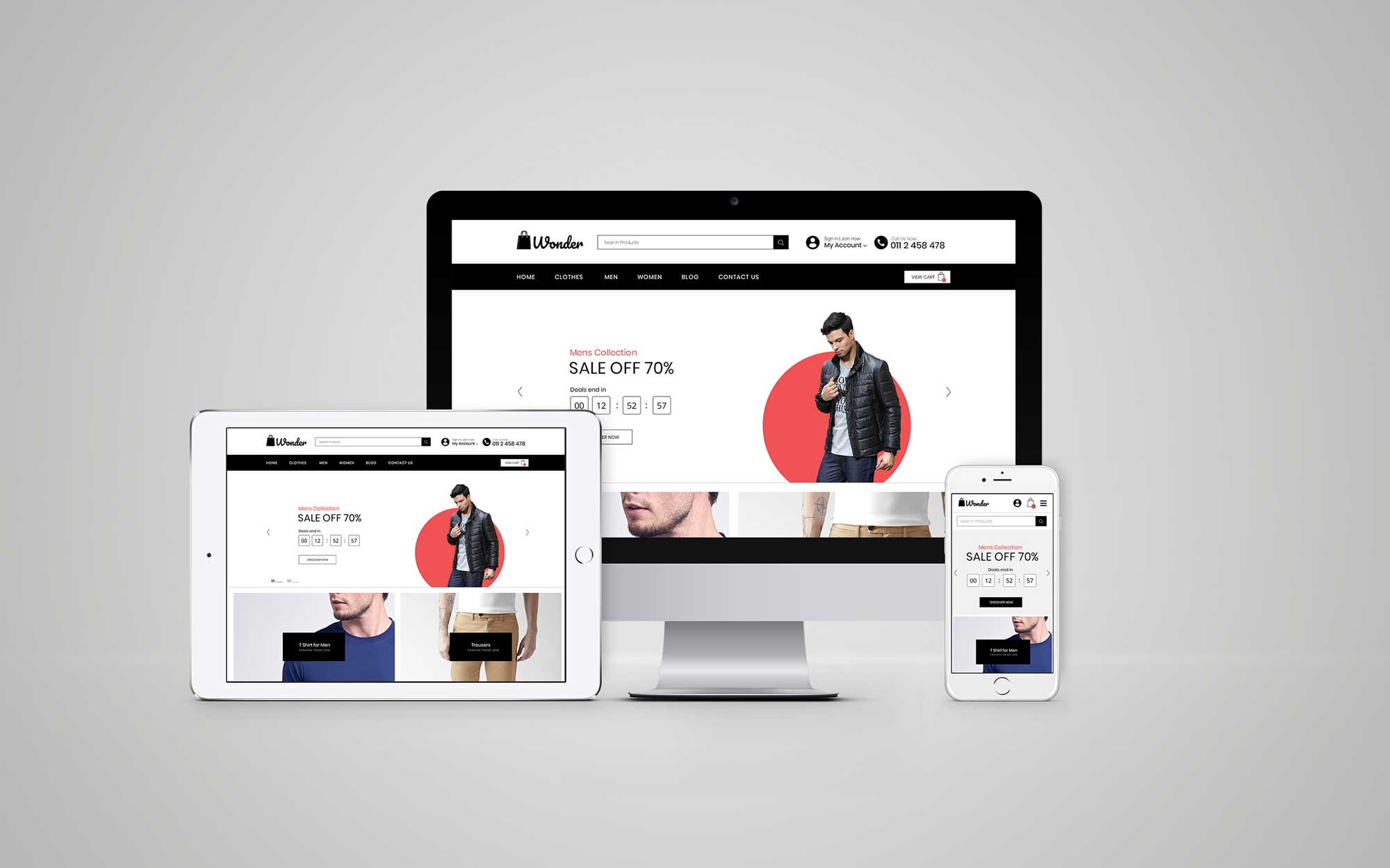
Wonder.lk’s website is currently under construction. It’s been a while since our last article. So I decided to ask Lakshitha our UI/UX Engineer to share the key points he considers when creating a website design. ~Tony
Hey guys!! Lakshitha here. Tony wanted me to guest-write for Starting Something. So a bit of who I am before I begin. I’ve been the UI/UX Engineer at DoMedia for nearly 2 years. Designing many websites during my time at DoMedia has made me have the vision of making each and every website design user-friendly and simple while making sure the key elements in the design are top-notch and are marketing-friendly.

A website should always aim for the following two characteristics in a website design.
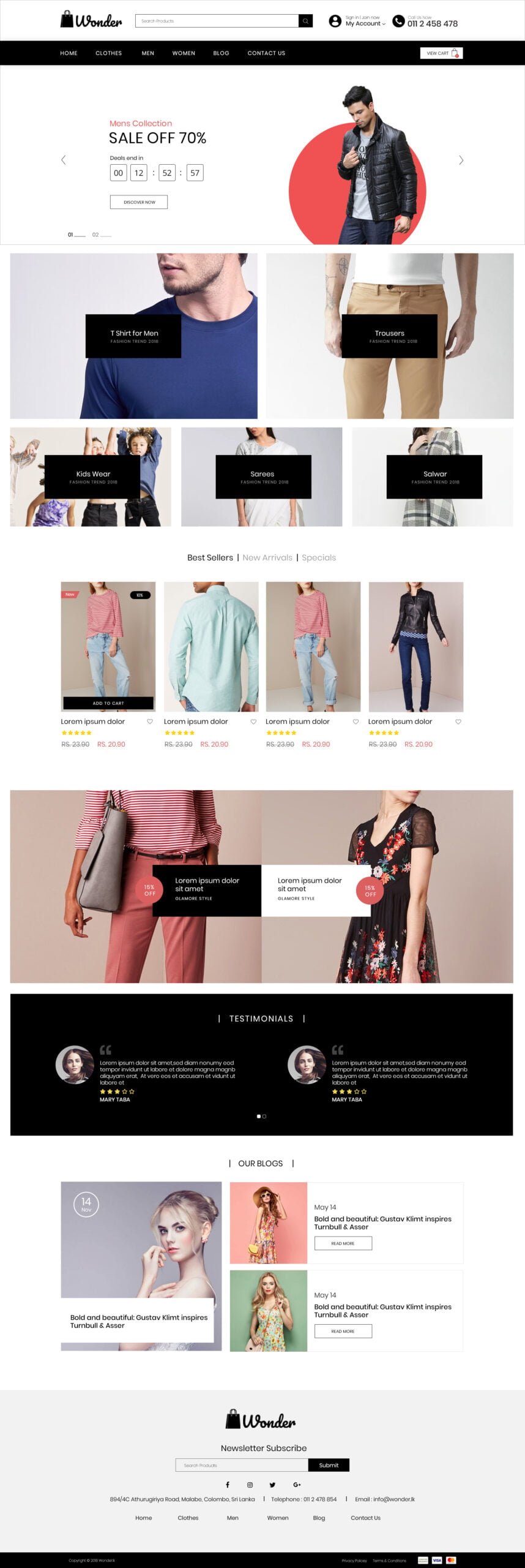
User friendliness– User friendliness means usability. Like Steve Krug says “Usability is about people and how they understand and use things, not about technology.” Every designer should make sure that their design is for everyone, from senior citizens to toddlers if possible. A brilliant design fits all. Keeping that in mind, I designed wonder.lk’s website with this in mind.
Simplicity– People use their devices today from dawn till dusk spending a vast majority of their time online. Websites have to be visually comfortable for everyone thus the necessity of simplicity arises. Simplicity is king. As you can see in the wonder.lk design, simple typography, colour and shapes have been used to make it visually appealing to the eye. Wonder.lk visitors are bound to use the website for quite a while since it takes time to pick a product which is the main reason why we chose to have simple elements to make the user feel comfortable.
Key Elements to create an attractive website.
Typography – As Oliver Reichenstein says in his article “Web Design is 95% typography”: OPTIMIZING TYPOGRAPHY IS OPTIMIZING READABILITY, ACCESSIBILITY, USABILITY AND OVERALL GRAPHIC BALANCE, I believe that good typography could give the user the interest to go through your website, whereas if it is bad it might put them off immediately. Try to stick to using at least 3 fonts for your website so that it would be professional and give the website an appealing look.
Colours– 85% of shoppers base their purchase on colour (I usually tend to pick an item which is more colourful than the other. I believe this is a psychological thing which is common). With this being said it’s quite obvious that colour should not be taken lightly. Using colour to your advantage on your website could be quite a tricky deal. From the beginning, we decided to keep our colour in black and white so that our fashion items will be highlighted when they are on the website. Choosing the right background colour would depend on the purpose of the website and should definitely go with the logo.
Shapes– Each shape has its own definition take a look at them here <Psychology of Shapes>. Shapes play an integral role in a website. Shapes insert the meaning you want to add to your website, whether it be excitement, reliability, mystery or balance. I’ve used 4-sided shapes (squares and rectangles) in the wonder.lk design to give the meaning of reliability and security to our website.
Pictures– Pictures add spice to a website. A well-known idiom “A picture speaks a thousand words” is something each an every designer has to keep in mind. Quality, Uniqueness, Emotions, Powerfulness and Brand Relevance are key points which should be addressed in each and every picture used in a website. Initial images used in my design for wonder.lk are dummy images since we still have not taken photographs of our products. However, the images used to give us an idea of how the photographs taken for our website should be. This is quite vital since it would give
Alignments– Alignment gives an order to a website. Text can be aligned in 4 distinct ways – left, right, centre and justified. Images too in the same manner but they depend on the size of each image and its relation to the other elements in the website. Alignment provides a clean design. It is actually the most important feature out of the features I’ve mentioned because good alignment provides satisfaction for the viewers (This is yet again another psychological factor. No one like things out of order)
This design is just for the beginning, we will update the design in the future according to the feedback we receive from the customers. So that’s it, folks. Hope you guys will be able to create splendid website designs with these points in mind.
~Lakshitha
That was quite a lot right there. I thought designing meant a few clicks and making sure the design simply looked good. Quite silly of me. Glad to have learnt this.


