Wonder.lk is an Ecommerce venture which is still under construction which aims to sell fashion items. This is the 5th article of the “Starting Something” series which is of how wonder.lk takes off.
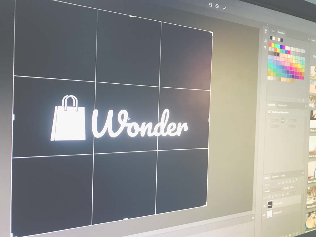
We already had a logo which was made a year ago, however the team wanted to rethink if it was fitting our needs. The team gathered together to discuss about the logo in the conference room.
![]()
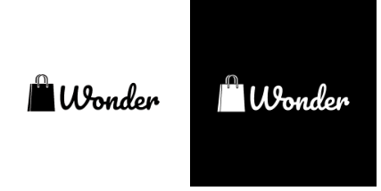
Even though the logo was nice, the colours did not feel suitable and the logo of the shopping cart failed to depict the idea that wonder.lk is a clothing store. Deciding to keep the font as it is because the team liked it and was simple. Thilina asked Lakshitha (Our UI/UX Engineer) to give a revamp to the logo by changing the colour and replacing the shopping cart symbol with another logo.
Quite excited on how things were proceeding I sat down with Lakshitha to get some info for you guys on how the logo was revamped.
KEY POINTS WE CONSIDERED:
WHEN MAKING THE LOGO:
- We wanted it to be memorable, so that whenever anyone sees the logo he/she should recognize it as an Ecommerce store.
- We wanted our logo to communicate the feeling of the brand.
- The logo had to match the type of product we sold (Fashion Items) We decided to use a shopping bag instead of a cart.
- Dare to be distinct. We love to be distinct, we wanted our logo to be unique.
- Making sure that we didn’t copy other logos but to have a look at them to draw inspiration..
- Keeping it simple so it can be put on any kind of material,background and in any size.
WHILE CREATING THE LOGO:
- Create a balanced design (Keeping the colours, graphics and size equal on all sides)
- Size matters. Our Logo has to be visible in all sizes. We had to make sure resizing it wouldn’t cause significant changes to the logo
- Choosing colours wisely. We made sure we used colours which are not hard on the eye. Here is an infographic on colour psychology in logo design.
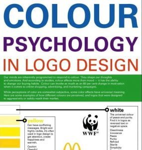
Click here for full Info-graphic
- We avoided fonts which would be difficult to read. Clean typography is important.
- We also avoided using too many effects.
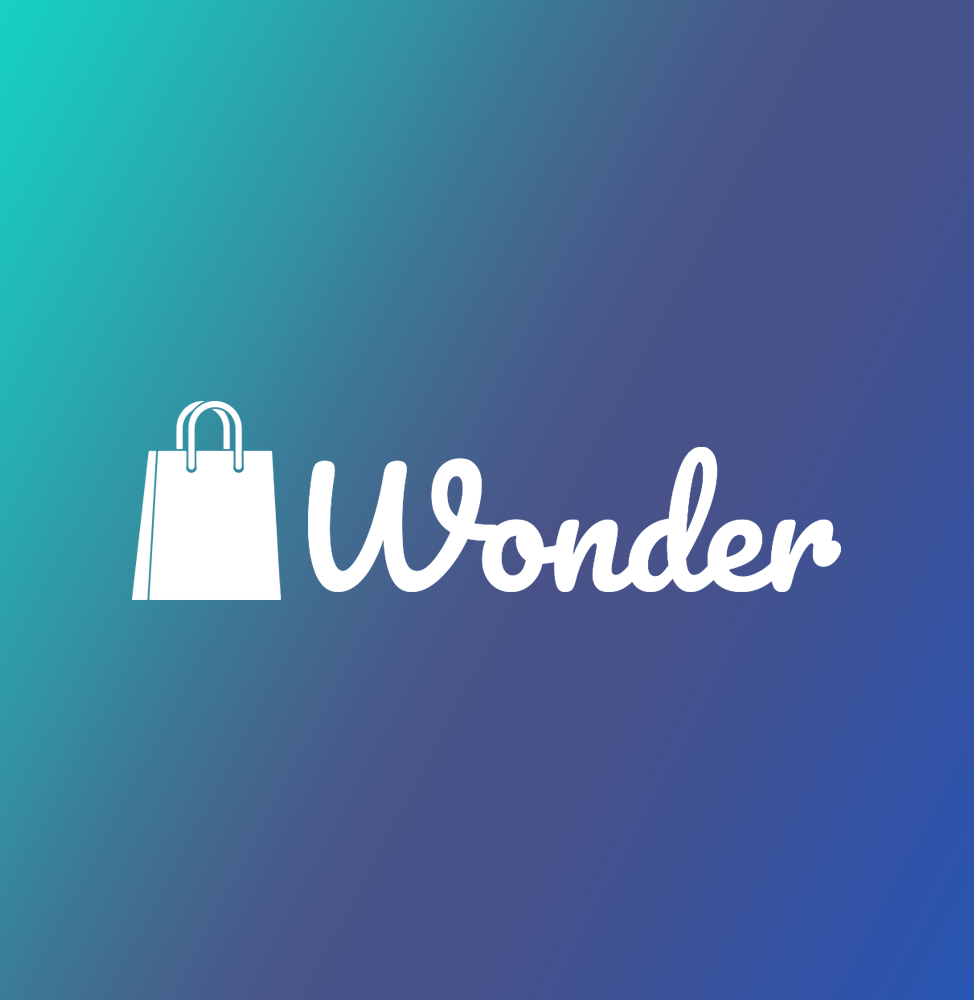
Lakshitha came up with 9 different designs. Lakshitha was asked to choose about 4 logos which he thought were more suitable. The team was then given the chance to pick the logo which looked best.
9 Designs Lakshitha came up with:
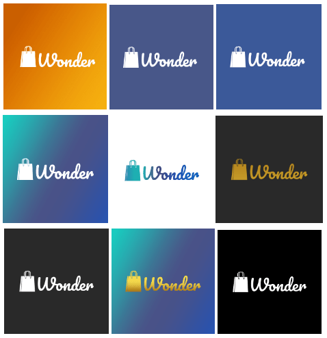
You guys might tend to wonder why we have used the same design over and over again with just a change in the background and font colour. This is because we were content with the typography we had, and we settled down with using the shopping bag logo.
Pro-Tip: Always create many different unique variations of the logo for better results.
Designs which were given to the team to choose:
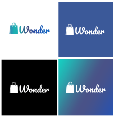
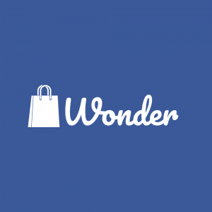
Finally after almost an hour of discussion wonder.lk had a new logo.
Reasons why we chose this:
- The colours were simple and provided a premium feel to the logo.
- The colours could be shifted to match the needs type of material this logo is put on. (such as on paper, packaging, online and so on.)
- Could be used in the following ways. (adaptable to many backgrounds)
- Printing would be much of a hassle, since the colours are elementary.
Reasons why the others were rejected:
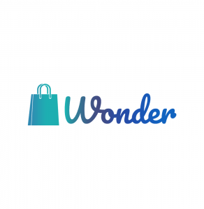
Words can’t be printed easily owing to the gradient. This wouldn’t be nice on a dark background. Wouldn’t suit all other colours, restricting the colours chosen for social media and other campaigns.
Using this logo, it cannot be put against a white background. If the logo has to go with any other background it should be inside a box with the blue colour remaining as a background. This would not provide the flexibility of putting the logo wherever required.

The background gradient makes it difficult for printing. A box around the logo is needed similar to the above one.
Well our logo is also done, we now have to prepare for our opening. We’ll announce our store’s opening date soon. Leave your E-mail address in the comments for more on wonder.lk
Click here for the previous article
Stay tuned for more…
Till next time,
Tony ⚜